SKIVA
A new application for the replacement of the physical bag tags currently used to rank players over the course of a season within a casual local league.
Overview
Disc golf is one of the fastest-growing casual sports in the world. The sport is played like traditional golf, but with a frisbee disc and catch basket.
I set out to solve the problem of rank tracking with this case study. Rank tracking among local league players has typically been done using a physical numbered tag. The COVID 19 pandemic exposed a need to move the rank system digital and an opportunity to provide more player statistics and tracking.
The SKIVA project examined how small leagues might play and exchange ranking tags virtually.
Role + Activities
Timeframe
16-Week Project
Jan – May 2021
define
Problem Statement
Disc golfers need easily accessible digital tags so that they can track and trade without contact.
Key Features Proposed
Ranking
The current player rankings will be displayed for each of the leagues of which the player is a member. The users will also be able to get information on other user’s rank and tag history.
History
The proposed app will display a players’ current and historical tags per season and by league.
Digital Distribution
League administrators will be able to digitally distribute tags at beginning of season and during seasonal play.
Modifications
League administrators will be able to review scores after play and make modifications and corrections. Administrators will have final say on tag disputes.
Exchange
The players will be able to quickly exchange tags after a round is played casually. The players will also control release of their tags to other users and be able to “throw in” their tag for league nights.

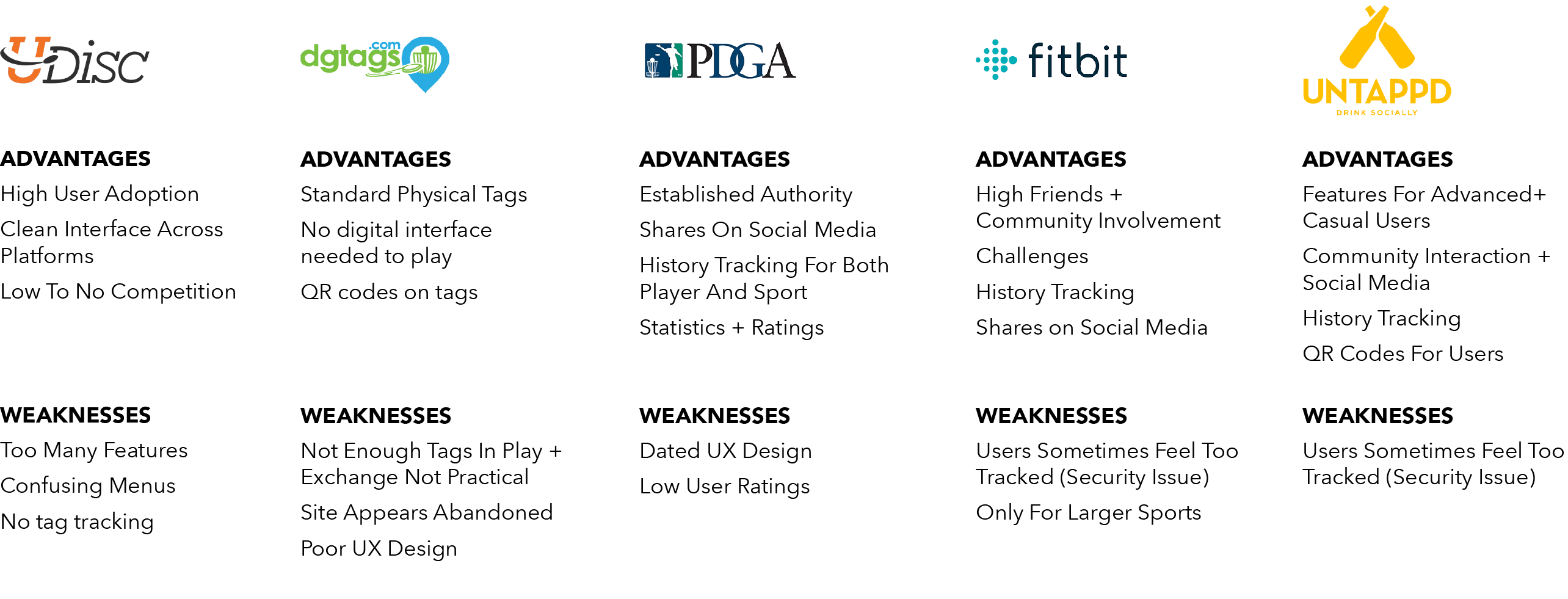
Competitive Analysis
Expert Interviews
In order to discover and better understand the problem space, I conducted interviews using target recruitment, on Reddit + Facebook, for individuals fitting my provisional personas. Eight people: four players and four admin, were interviewed for this portion of the project.
I set out to learn answers to these Research Questions:
Do virtual tags solve for…
no-contact tag exchange during pandemic play?
easy distribution of first tags at the start of the season?
visibility of player ranking within leagues during seasonal play?
trackable player ranking over seasons and a player’s lifetime?
Provisional Personas
Avery
player
Goals
Fitness + Outdoor time
Improve Game
Develop Friendships
annoyances
Low tag holders don’t come out to play
tags get lost + broken
unsure of personal tag history
Wants + Needs
Easy pick-up rounds with friends
encouragement to get outside + play regularly
the competitive rush within friendly play
Drew
admin
Goals
Grow local club membership
develop friendships
track states effectively
annoyances
taking larger tech out to course
players wanting data faster
tag hoarders keeping low tags all season
Wants + Needs
All levels to play well together
league night to be fun + lighthearted
statistics tracked over entire season easily
high community involvement
Research Discovery
01
Tags are bragging rights
A key finding for me was that, for most players, tags are about support of the league and tag number is less important to a seasoned player than how they score for a round.
Players use tags as bragging rights among friends and play tags often but they see these matches as practice for tournament play that will improve what they really care about, their PDGA ranking.
02
The rush of competition
Players seem to value the joy of individual success in a group setting. And tags are seen as a small trophy of that success.
03
The community is strong
Players like having physical tags, as representations of their club membership, on their bags and they use the tags as conversation pieces to encourage new players to join as well.
04
Virtual tags are the future
Players suggested that virtual tags could open new ways to play the sport. For example, to correct tag hoarding, to create a mini-league among friends, and to exchange friendly banter. Interviewees seemed excited about the future of tag play.
Virtual tags are seen as a key transition in the future of casual play and not just for use during pandemic times.
Development Pivot
After reviewing all the data, I saw an opportunity for virtual tags to be introduced as a new entity, without overtly removing or trying to replace physical tags.
Target + Goals
Start Small
Large leagues are complex organizations that offer so much more than tags. Starting small would be an opportunity to create excitement around the app. We can draw from the example of Facebook, which began with distribution at elite universities and developed a buzz and exclusivity before expanding to the public. A similar strategy here could help grow the app up to larger leagues incrementally and manageably.
New Ways To Play
The product should focus on adds + perks, offering ways to play that aren’t possible with physical tags. For example, hosting week-long challenges with scores submitted, and tags distributed, virtually. Or offering players the ability to check tag ranking and invite the top players out for a round and a shot at a low tag. All these new ways to play could be tracked with passive statistics that keep players curious and coming back to the app for more play.
Design For Now
The pandemic doesn’t seem to have slowed the exchange of physical tags. Instead, disc golf has seen major growth this past year, so now seems to be a great time to add layers to the game and retain those new players.
How Might We…
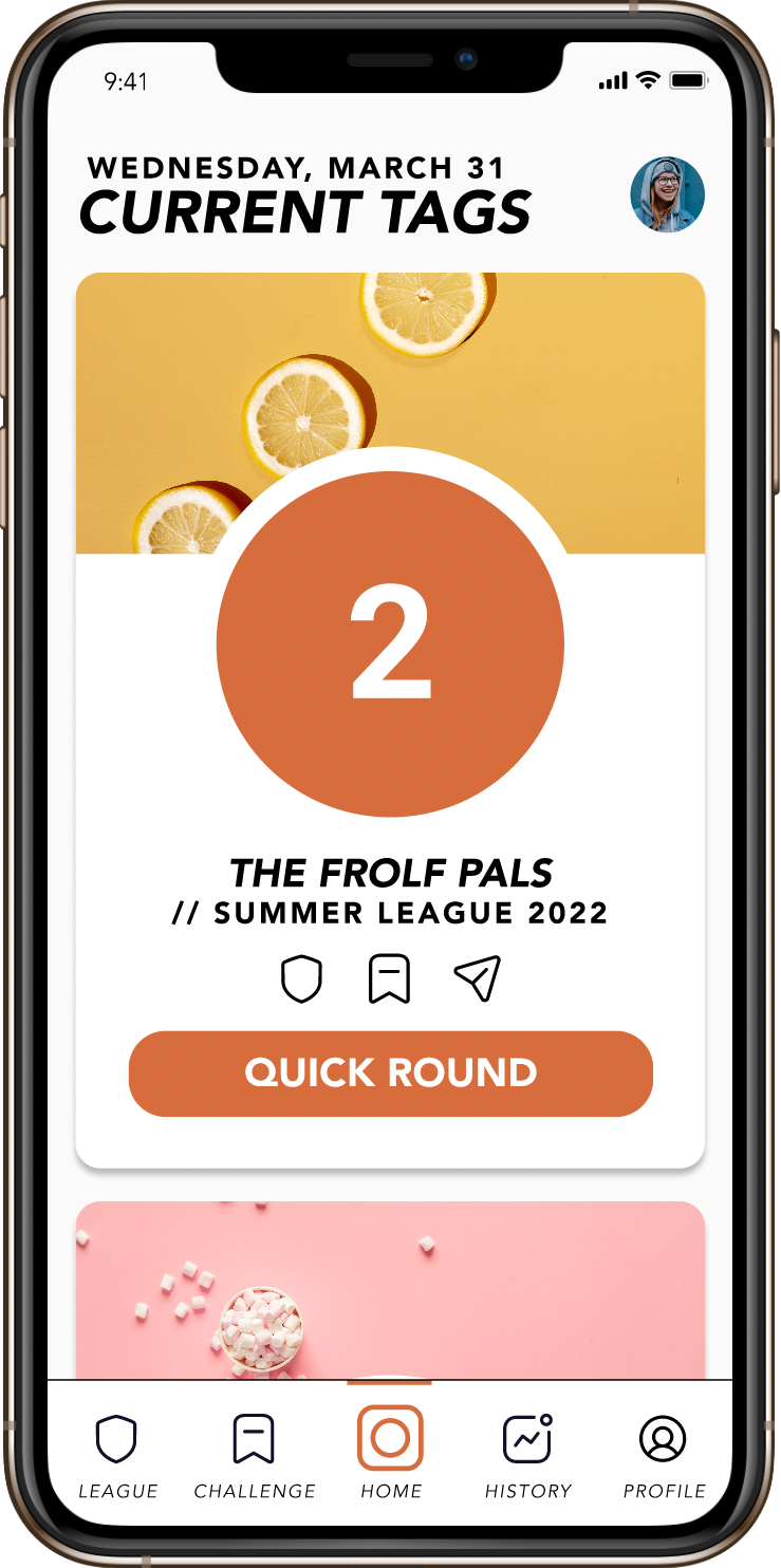
provide players with an easily accessible digital tag?
map
User Flow
I created a user flow based on the HMW statement and the research gathered during my initial interviews. This flow has the players check-in at the beginning and end of their round with no interaction required during play to maximize time spent on the course and with the community.

sketch
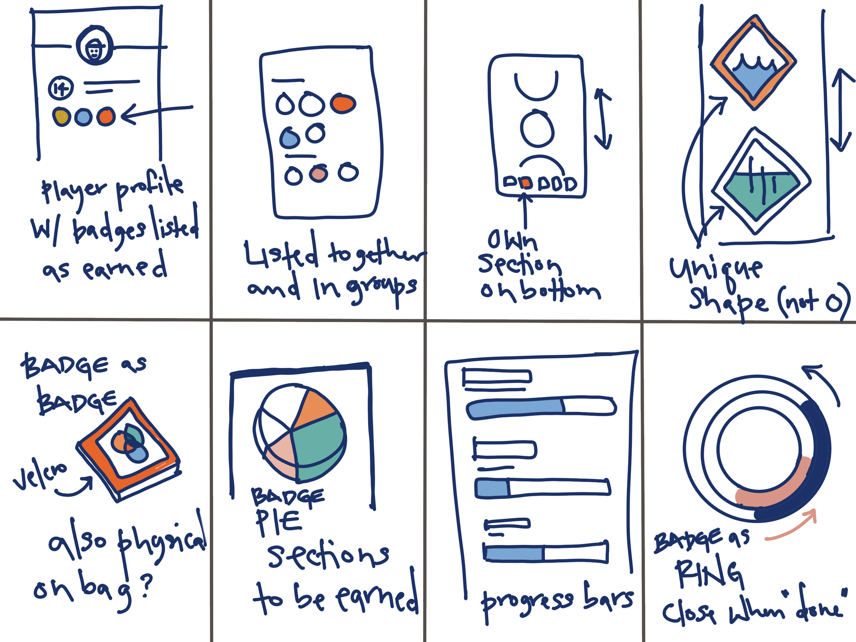
Crazy 8s
I began to think about what the user interface might look like by referencing existing apps as inspiration but then putting them away and spending time sketching on my own. I use Crazy 8s as a method to quickly get iterative ideas on paper and work towards a unique design.
PROTOTYPE / TEST / ITERATE
Wireframe
My next step was to develop a wireframe drawing on my sketches. I used this wireframe to run usability tests with a small group of subjects.


PLAY FLOW
version 01
Usability Testing
For the first round of usability testing, I interviewed three disc golfers with varying levels of experience to get a wide range of data. The Big Research Questions for this round of testing were:
Does the Home Screen and cards as virtual tag make sense?
Is the Game Play Flow intuitive?
Is the information provided on the Review Score screen concise yet informative?
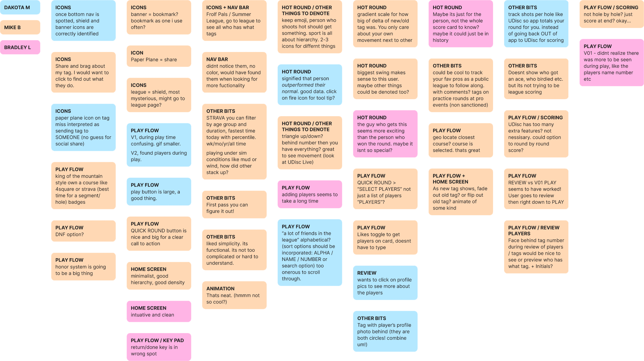
Affinity Mapping
Critique + Revisions
HOMEPAGE
Feedback
Users liked minimalist layout calling it “intuitive” and “clean.”
All users understood cards as tags.
Users were able to surmise the meanings of icons shown when given nav bar with titles.


HOMEPAGE
Feedback
Users liked minimalist layout calling it “intuitive” and “clean.”
All users understood cards as tags.
Users were able to surmise the meanings of icons shown when given nav bar with titles.
GAME PLAY FLOW +
PLAYER SELECTION
Feedback
Users liked toggle to select players + not typing each name out in full.
It seems to take a while to get all players selected and move on to next step.
Iteration
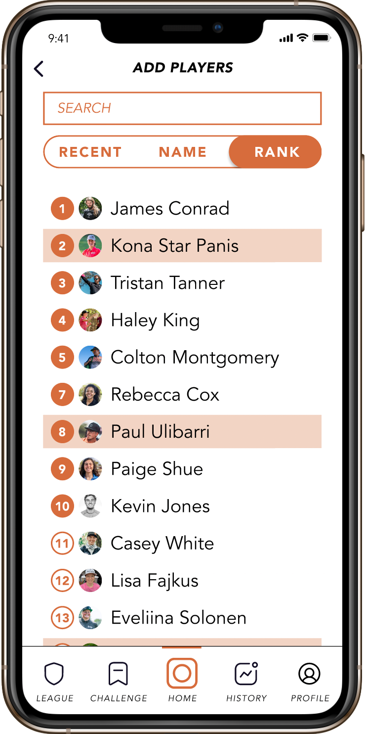
Provided options to sort by
RECENT / NAME / RANK + search bar
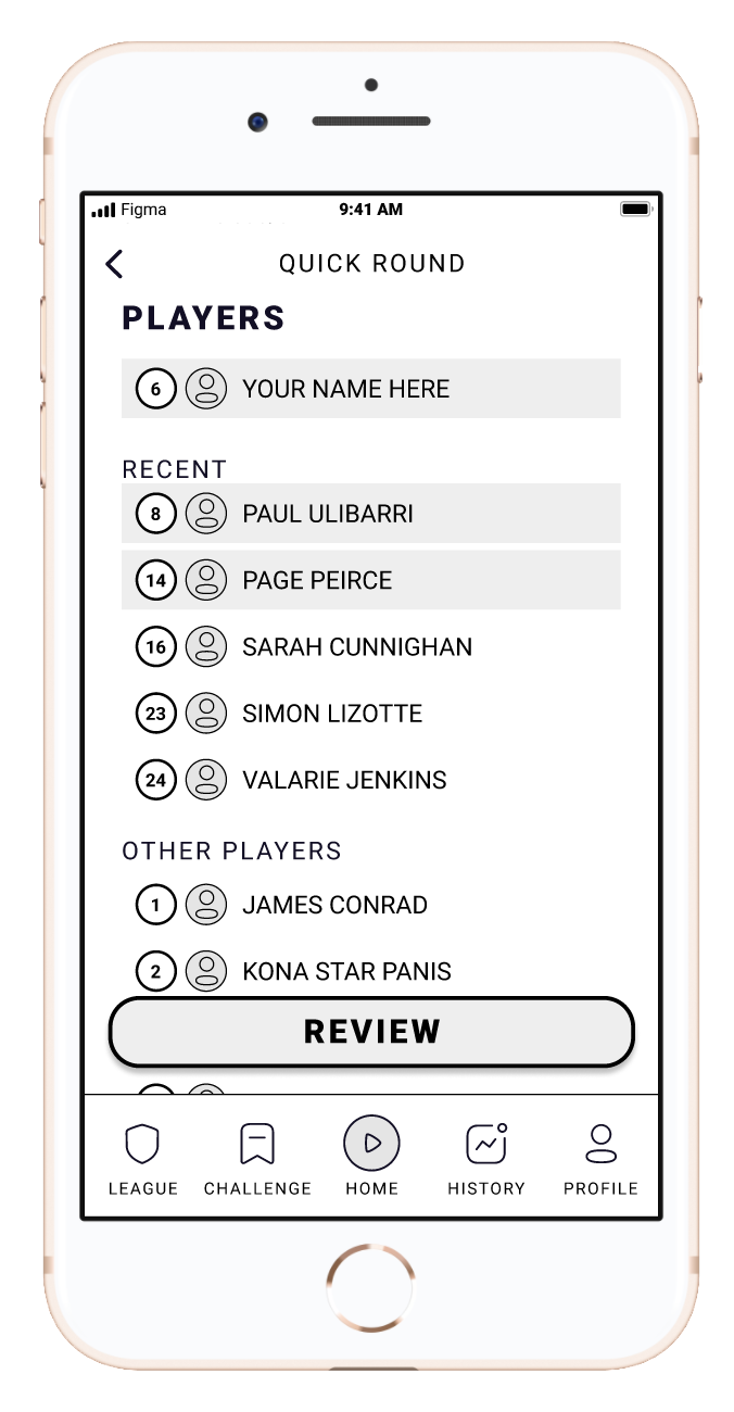
version 01
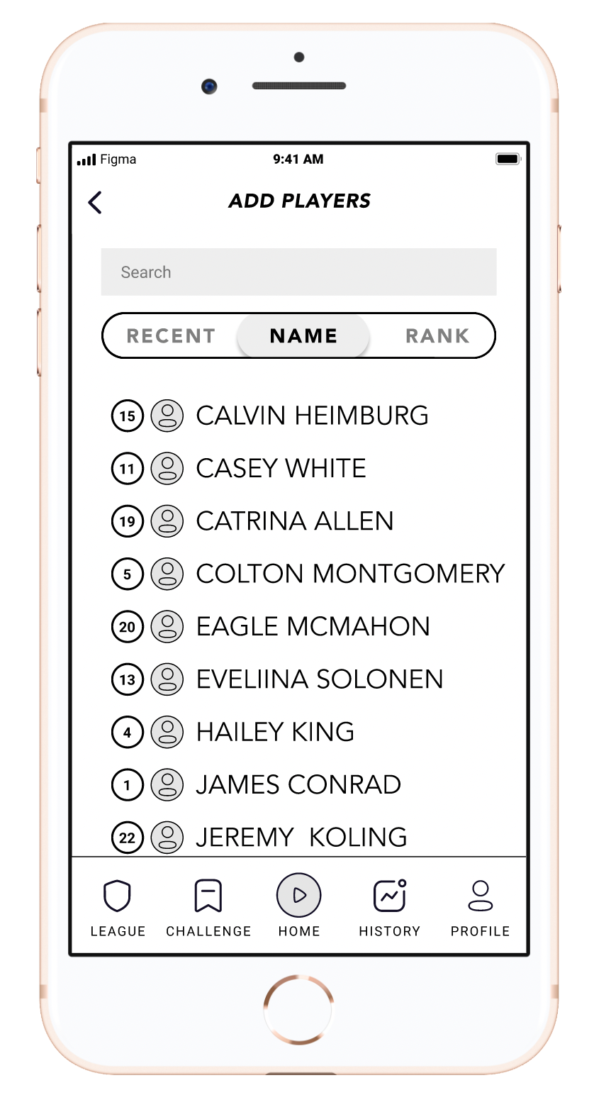
version 02

version 01

version 02
GAME PLAY FLOW + PLAYER SELECTION
Feedback
Users liked toggle to select players + not typing each name out in full.
It seems to take a while to get all players selected and move on to next step.
Iteration
Version 02 provided options to sort by RECENT / NAME / RANK + search bar
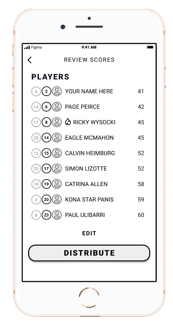
version 01
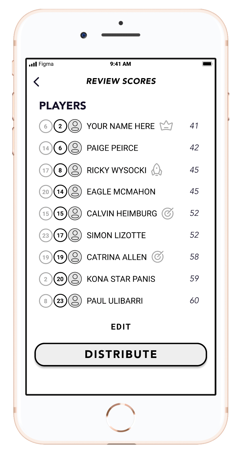
version 02
REVIEW OF SCORES
Feedback
“I’m confused… [it] seems like the person who got [the fire icon] is more exciting than the person who won the round.”
Iteration
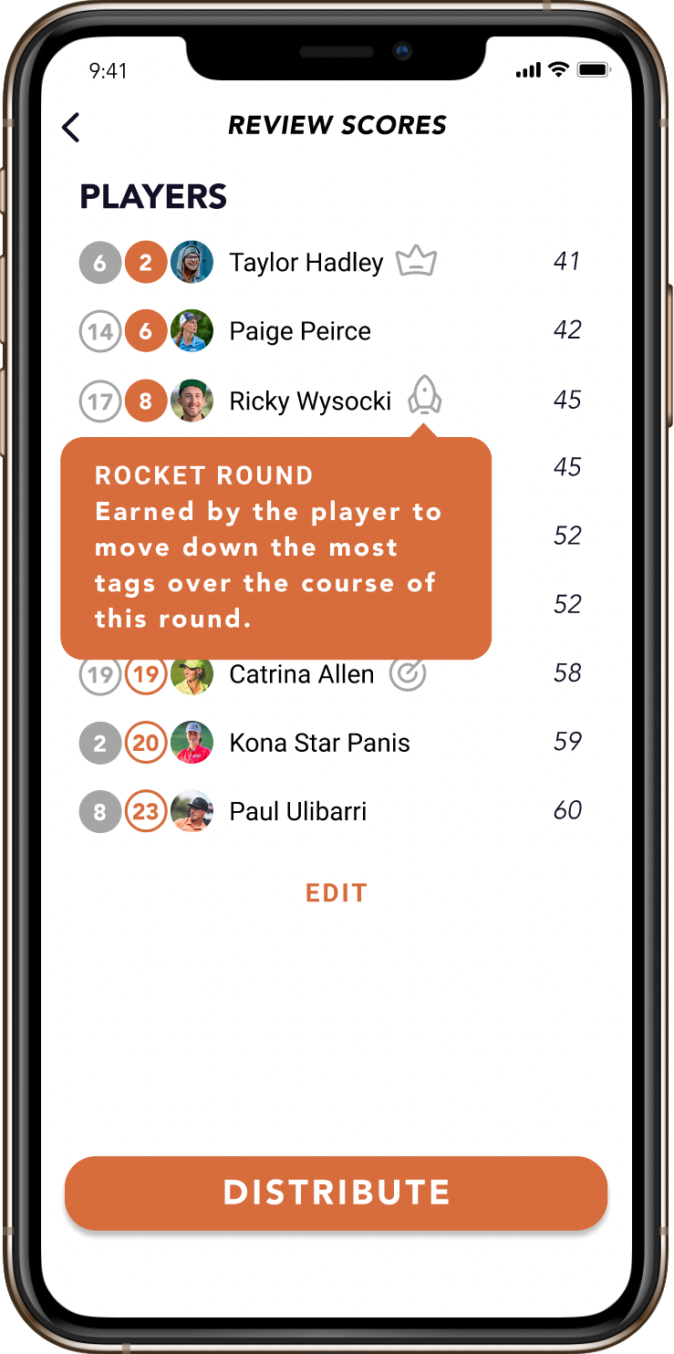
Deemphasized icons by moving them after names.
Tool-tips for icon explanation.
Introduce more icons for other notable accomplishments.

version 01

version 02
REVIEW OF SCORES
Feedback
“I’m confused… [it] seems like the person who got [the fire icon] is more exciting than the person who won the round.”
Iteration
Deemphasized icons by moving them after names.
Tool-tips for icon explanation.
Introduce more icons for other notable accomplishments.
Branding
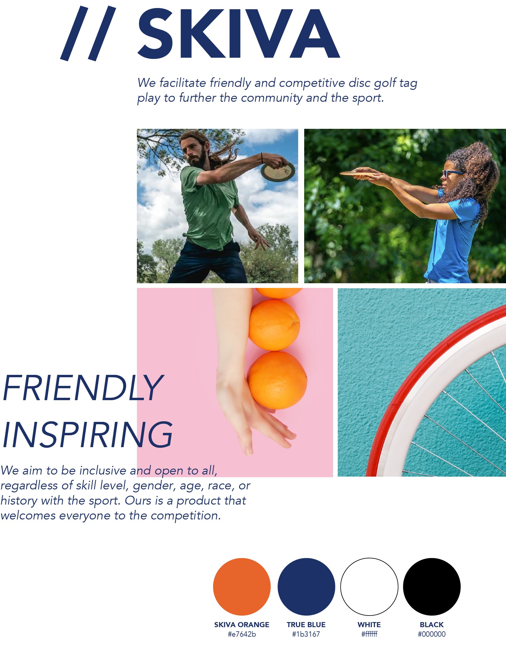
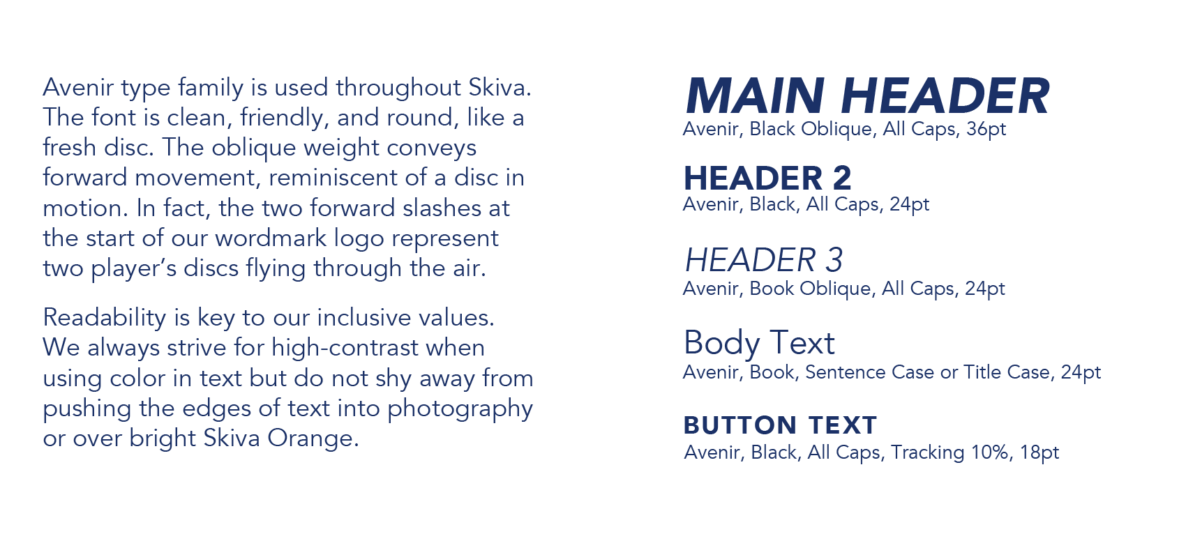
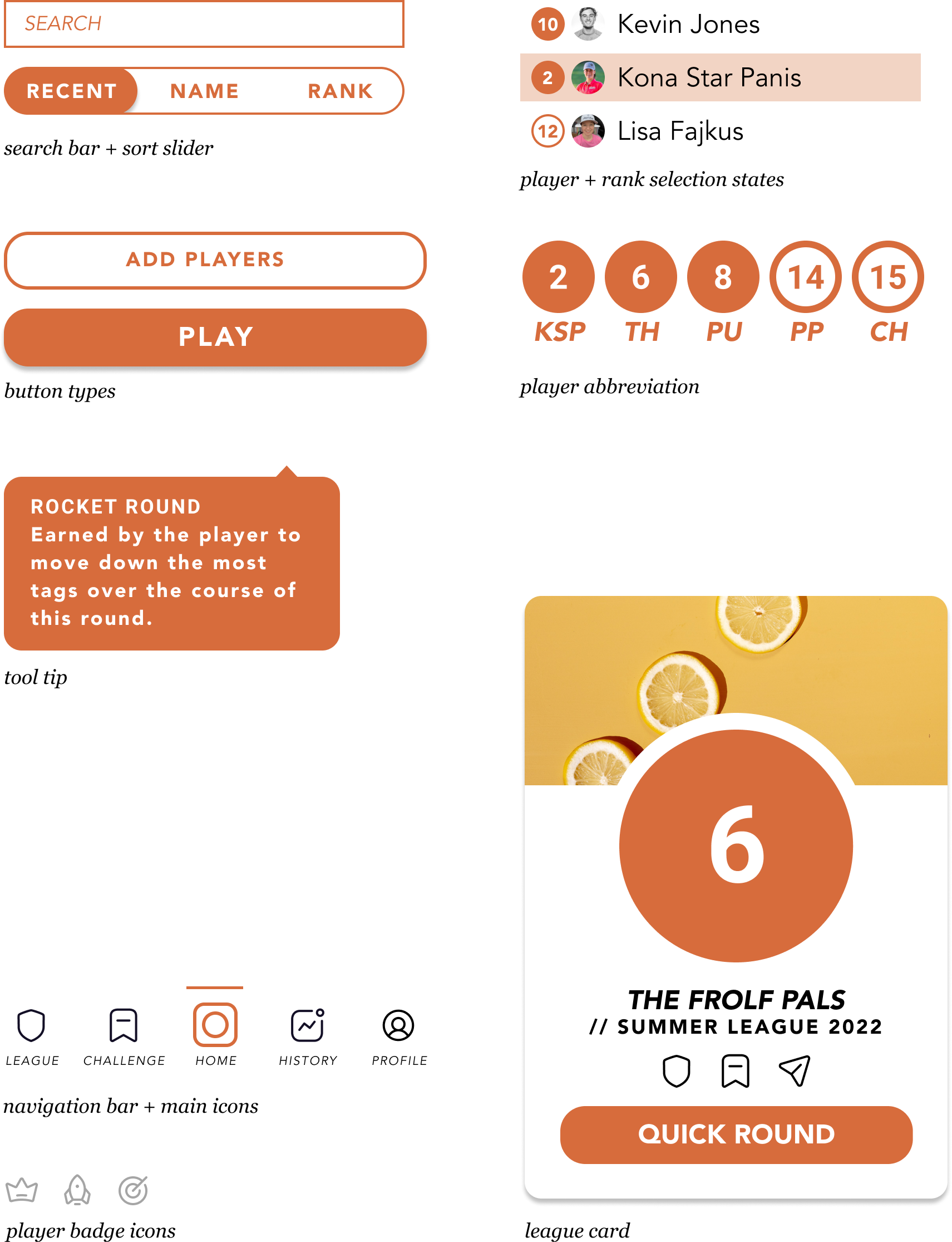
I created a branding guide to help give guidelines around the look and user experience of the application. By putting myself in the mindset of a business partner, I was able to create a voice for the Skiva brand and drive the vision forward.
MOODBOARD

STYLE OVERVIEW
TYPOGRAPHY
UI KIT
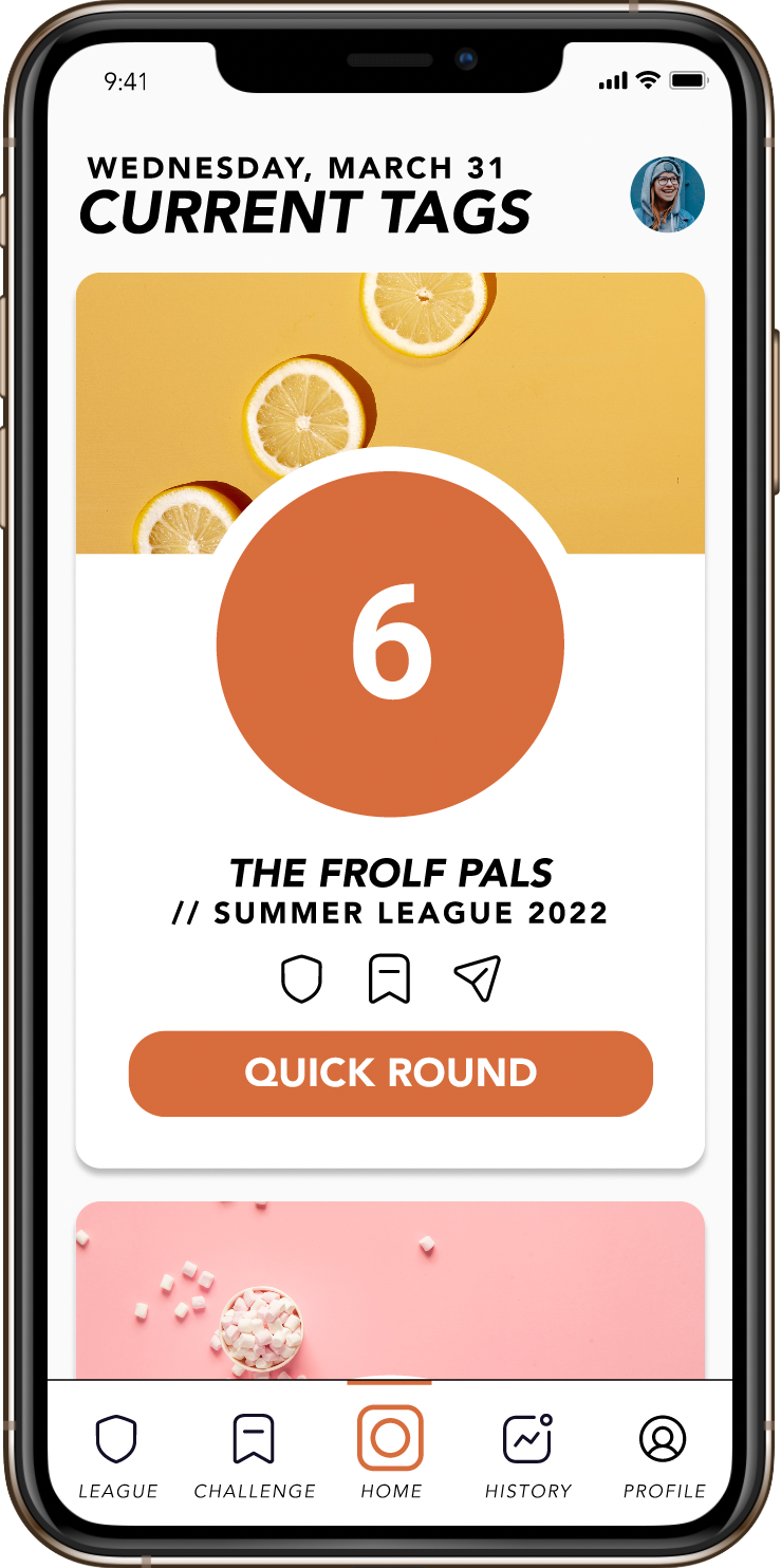
High Fidelity Prototyping
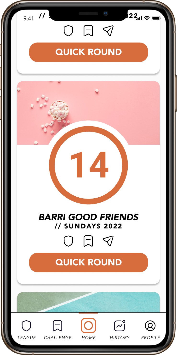
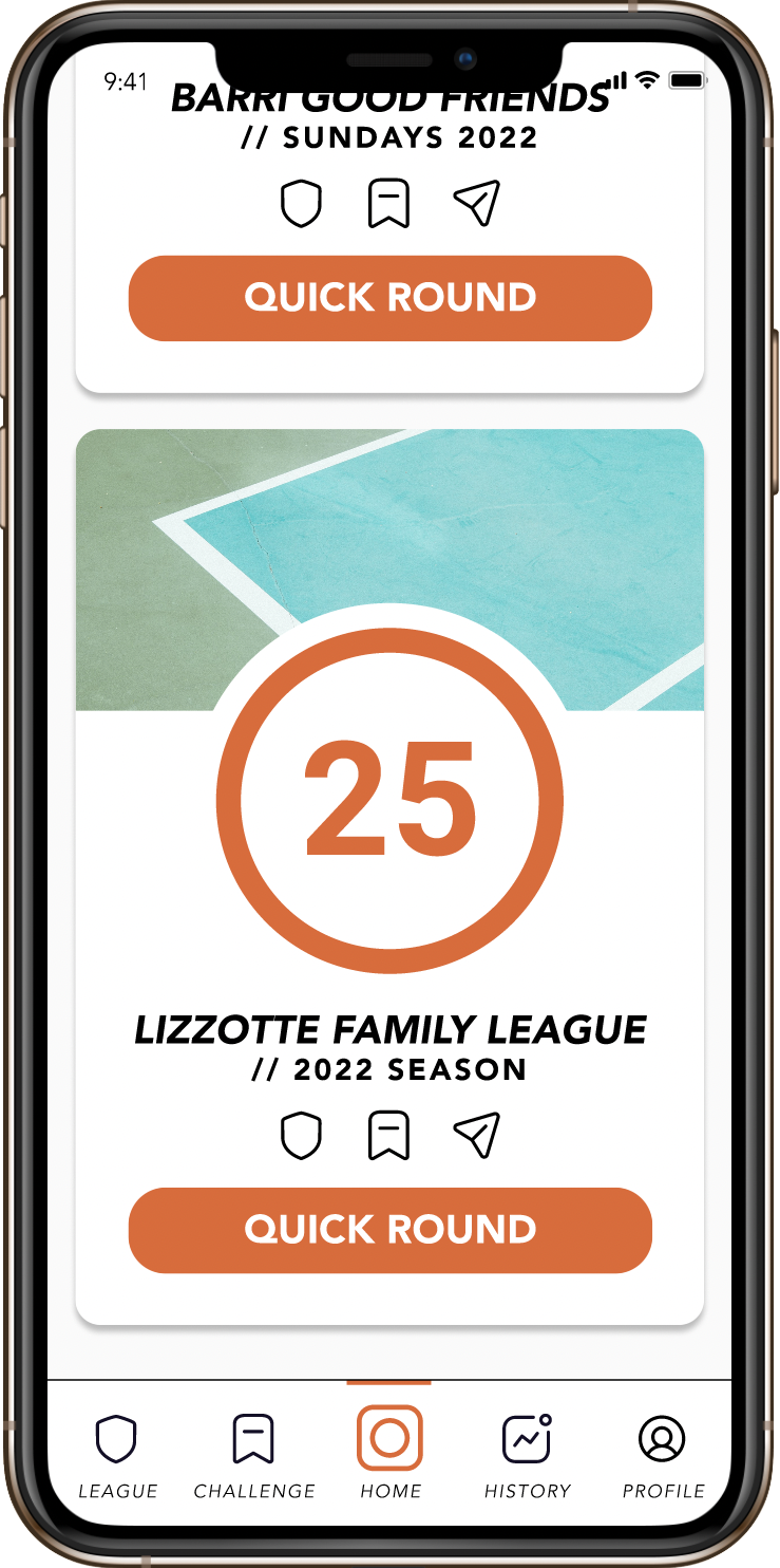
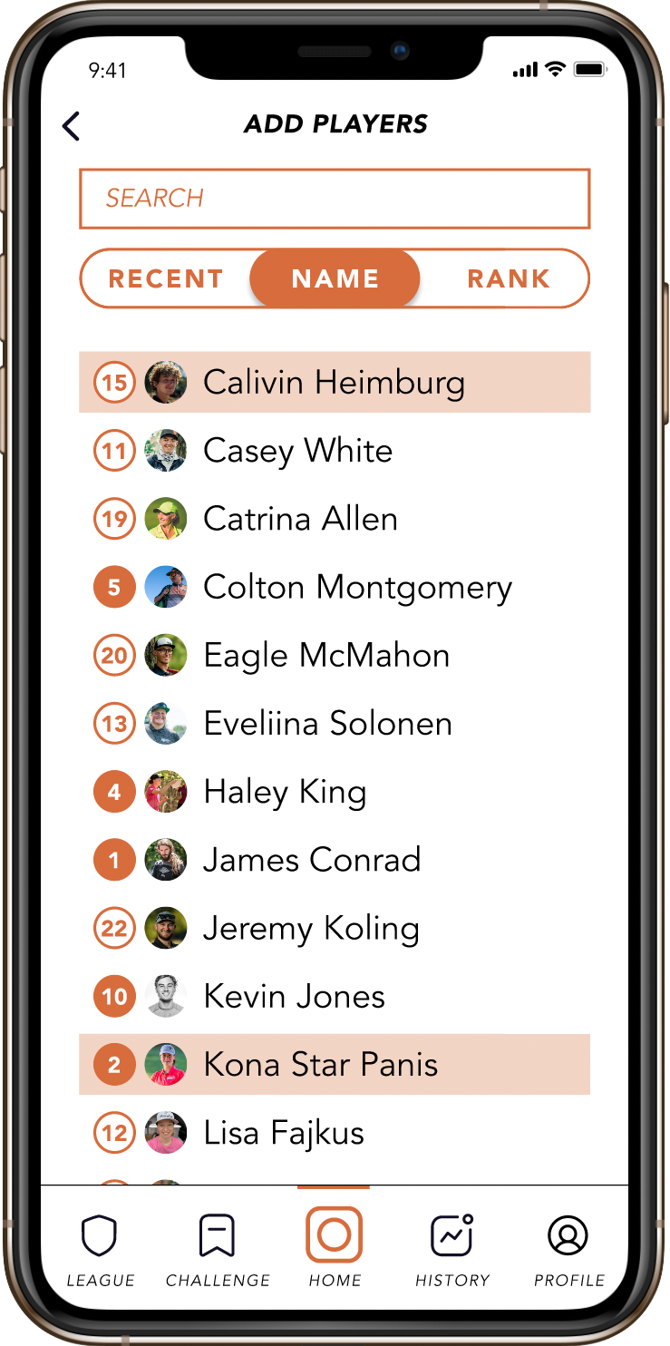
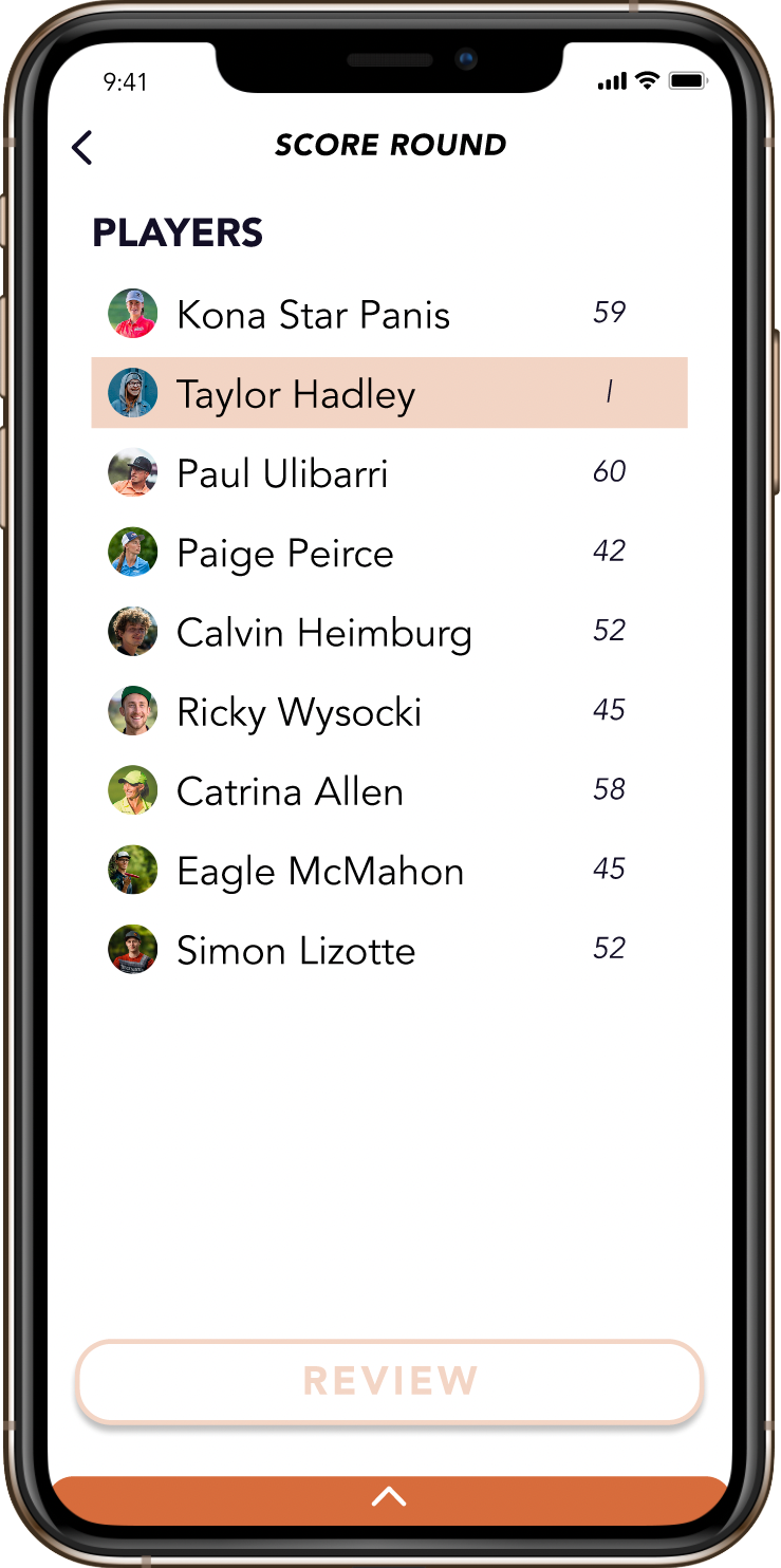
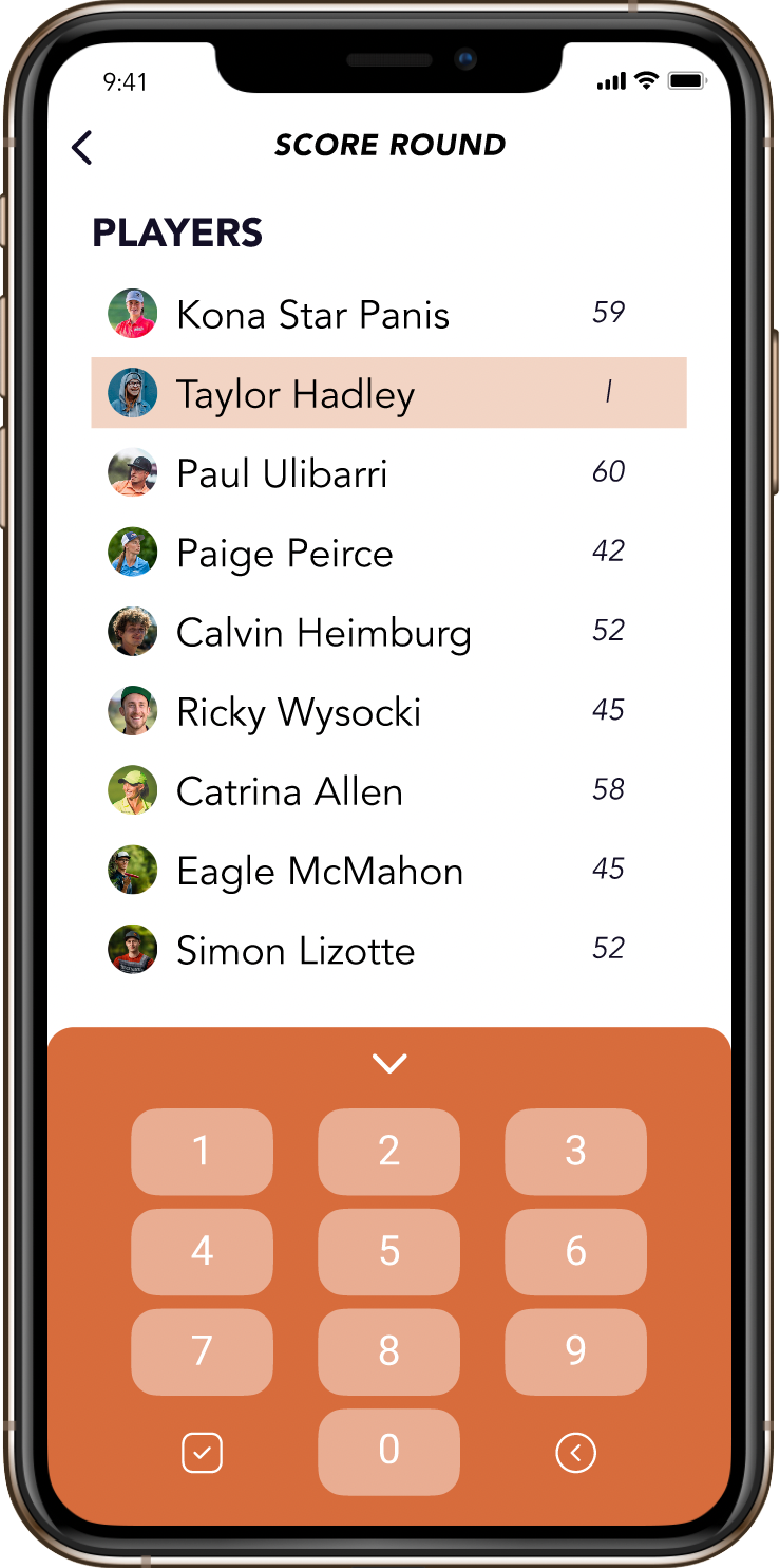
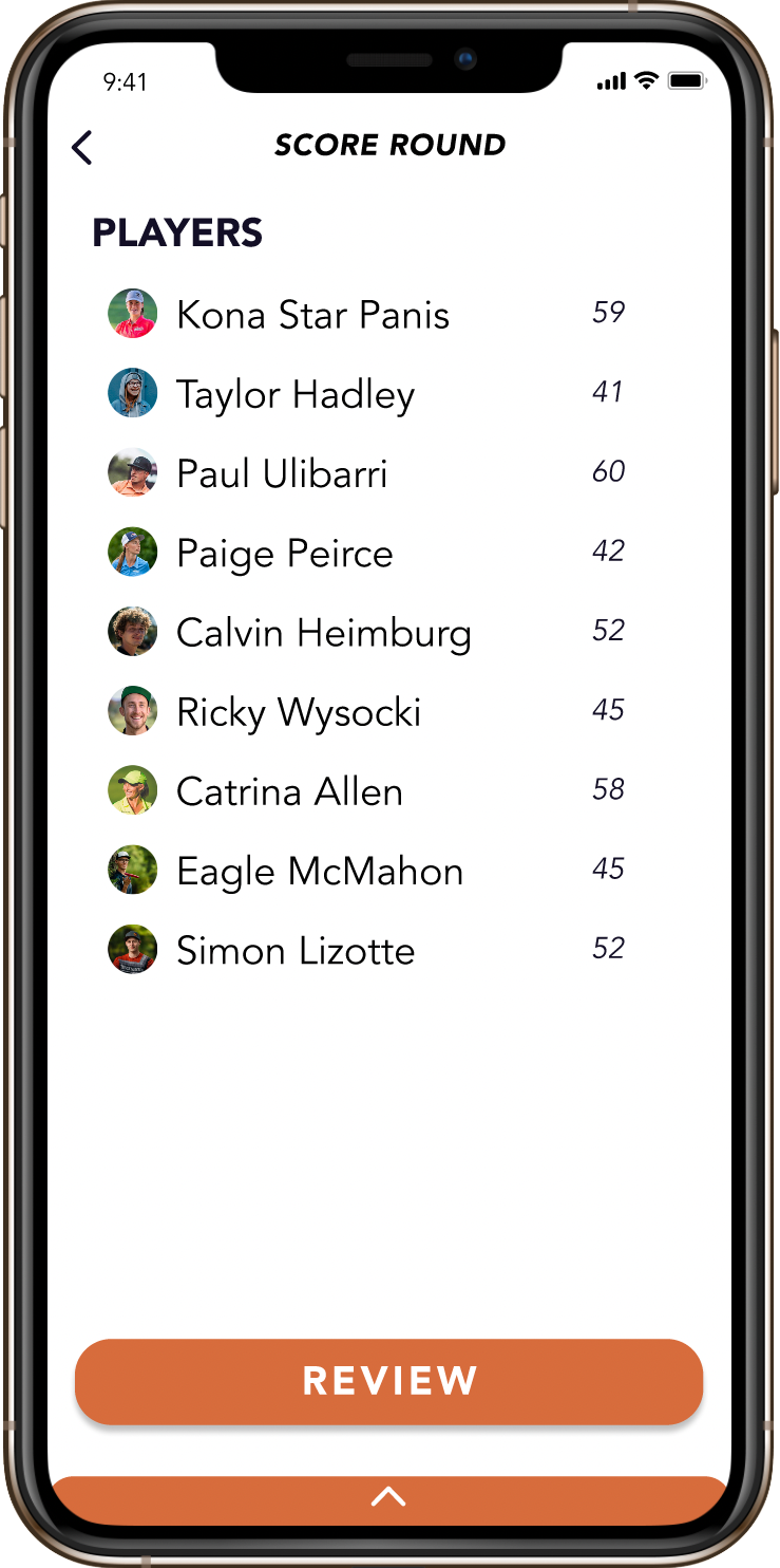
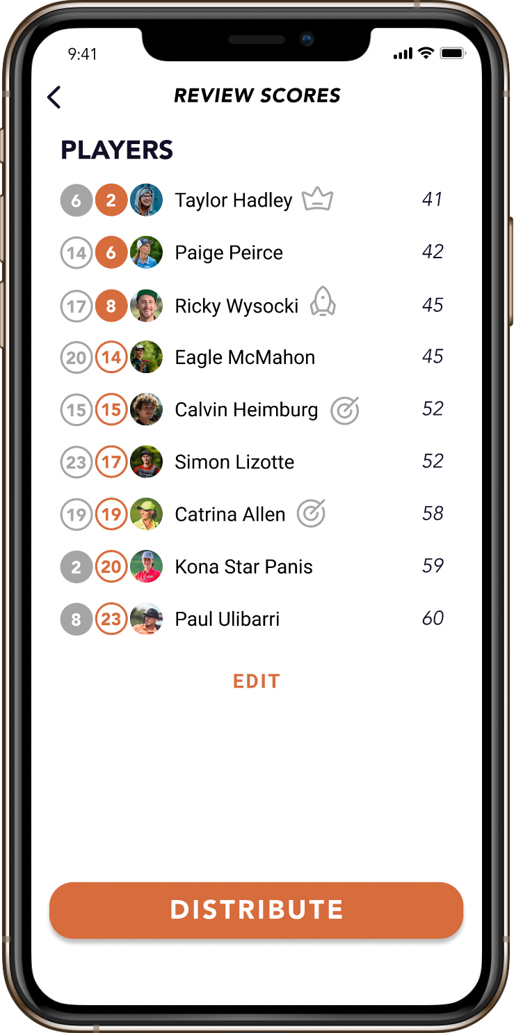
This final prototype balances clean, friendly design with my research findings for a full play flow.

Reflection + Next Steps
01
The Market
I validated that there is a market for this product by conducting user research at multiple key points throughout the design process.
02
Maintain Focus
I learned that by taking the project slow, focusing on the MVP, I can create space to focus on the essence of a project and make meaningful progress.
03
Build Next Features
Now that the main Play Flow is roughed out, it is time to move on to other features: League Pages, Challenges, History, and the User Profile. With the Play Flow foundation in place, these elements should be easily iterated.